Developer Platform
Uber Studio
Internal tooling so engineers could simulate the marketplace — riders, drivers, trips, failures — without a real car.
Testing Uber meant needing a rider, a driver, a city, and money for every engineer, every day. Studio made the whole marketplace simulable from a desk: spawn accounts, run trips through every state, and interrogate any internal service from one surface. I led design for the platform.
The product required the physical world to test
A trip needs a rider, a driver, a route, a payment method, and a dispatch system willing to connect them. Before Studio, that meant test phones on desks, personal accounts, and real cars driving real blocks to reproduce a bug. Or it meant not testing at all.
I led design in Uber's engineering platform group, where the users were the company's own engineers. The brief was simple to say and deep to build: make the entire marketplace something you can simulate without leaving your chair.
The marketplace as a sandbox
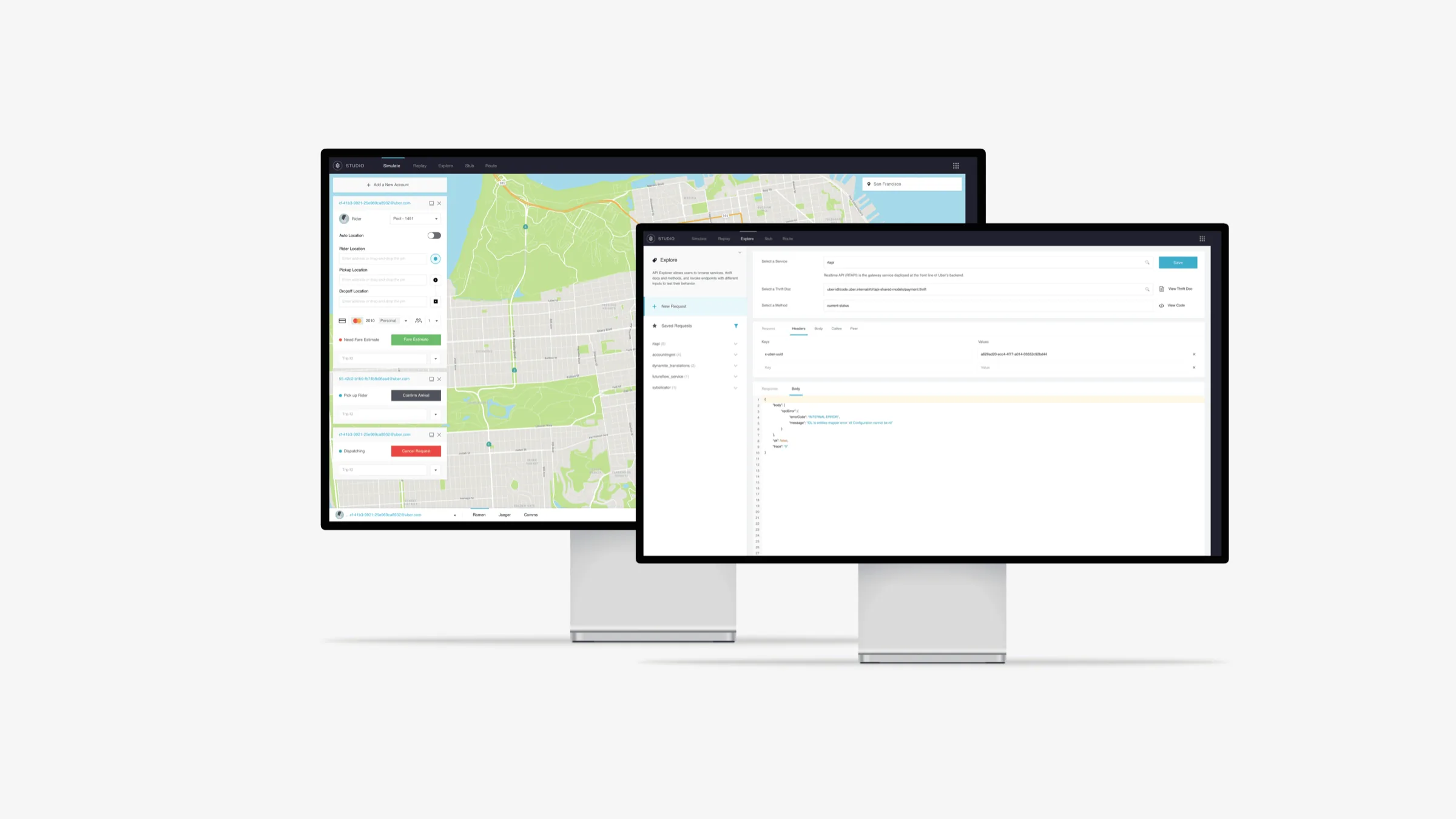
Studio's core surface puts simulated accounts against a live city map. Spawn a rider, spawn a driver, set pickup and dropoff, request a fare, and walk the trip through its real states, from dispatching and en route to pickup confirmed or canceled mid-request, with each account inspectable at every step. The states aren't mocked. They run through the production state machine, so what an engineer sees is what the system actually does.
The design problem was density with orientation. A single simulation might hold five accounts in different states, and the engineer needs to read the whole scenario at a glance: who is waiting, who is dispatching, what just failed. Account cards carry their state as structure, the map carries the geography, and nothing hides behind a modal.
Five accounts, one scenario: state as structure on the cards, geography on the map
Every service, one door
The other half of Studio was the API explorer: browse any internal service, read its Thrift docs in place, compose a request with real headers, and see the response, including the failure, without leaving the tool. Before that, interrogating a service meant finding its owner, its docs, and its quirks across three internal wikis.
Designing for engineers sharpened a conviction that has run through my work since. Expert users don't want simpler tools; they want denser ones that never lie. That is designing for operators, and it is why busy software still has to breathe.
Outcome
Studio's job was to show the system exactly as it was and make that exact state fast to reach. It became part of the default toolkit for engineers across the rider, driver, and payments teams.
- Users
- Uber's own engineers across rider, driver, and payments
- Surfaces
- Marketplace simulator, API explorer
- Principle
- Denser tools that never lie