Airline Operations
Delta
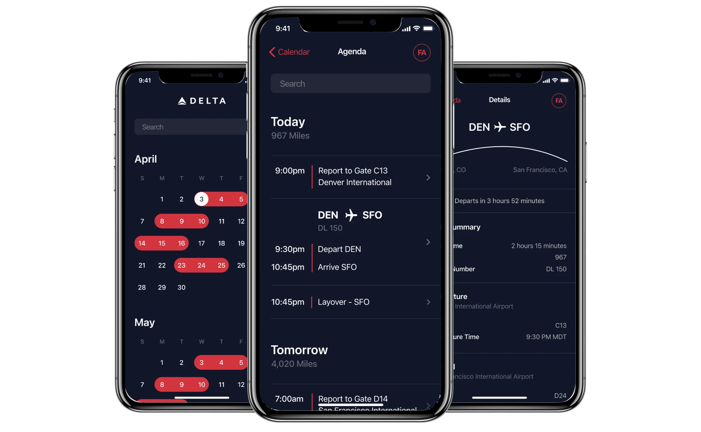
Delta's flight attendants used an internal app to see their trips. It showed one flight at a time, as a grid of times, gates and codes. I redesigned it to show their day in order: report to the gate, depart, arrive, layover, next leg.
A critique wasn’t going to be enough
Delta asked Apple to critique the app its flight attendants used on every trip. It had no standard controls, no consistent type or color and no clear hierarchy, and it had been designed without input from the people who used it. On the ground, we watched the app itself cause long delays.
Apple ran these engagements as design sprints, staffed by consulting engineers; another that year was Abbott’s Patient Controller. Ours was two people, an iOS engineer and me. Delta had to bring executive sponsorship, so three of its executives took part with their direct reports, and three flight attendants sat with us for interviews and testing. A one-day sprint on site grew into about two weeks with crews, on the ground and in the air.
Organize by time, not by flight
The old screen gave everything about a flight the same weight and left the crew member to work out the day. Report time was a line under the flight number. Departure and arrival sat side by side. What came next was a gray bar at the bottom.
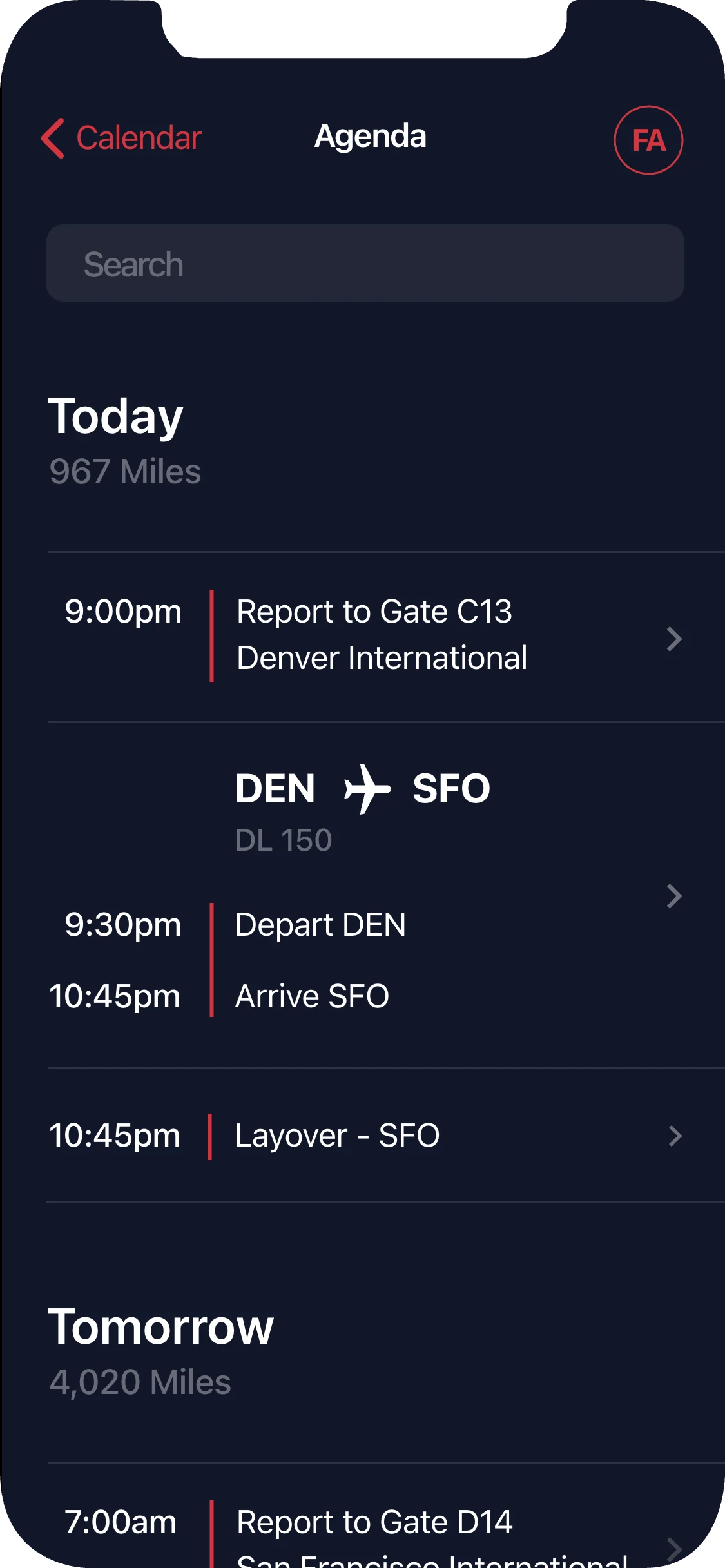
The new agenda takes the shape of the agenda view in iOS Calendar, which anyone with an iPhone already reads. Time runs down the left, and every duty is a row: report to the gate, depart, arrive, then the layover. Tomorrow starts with the next report time.
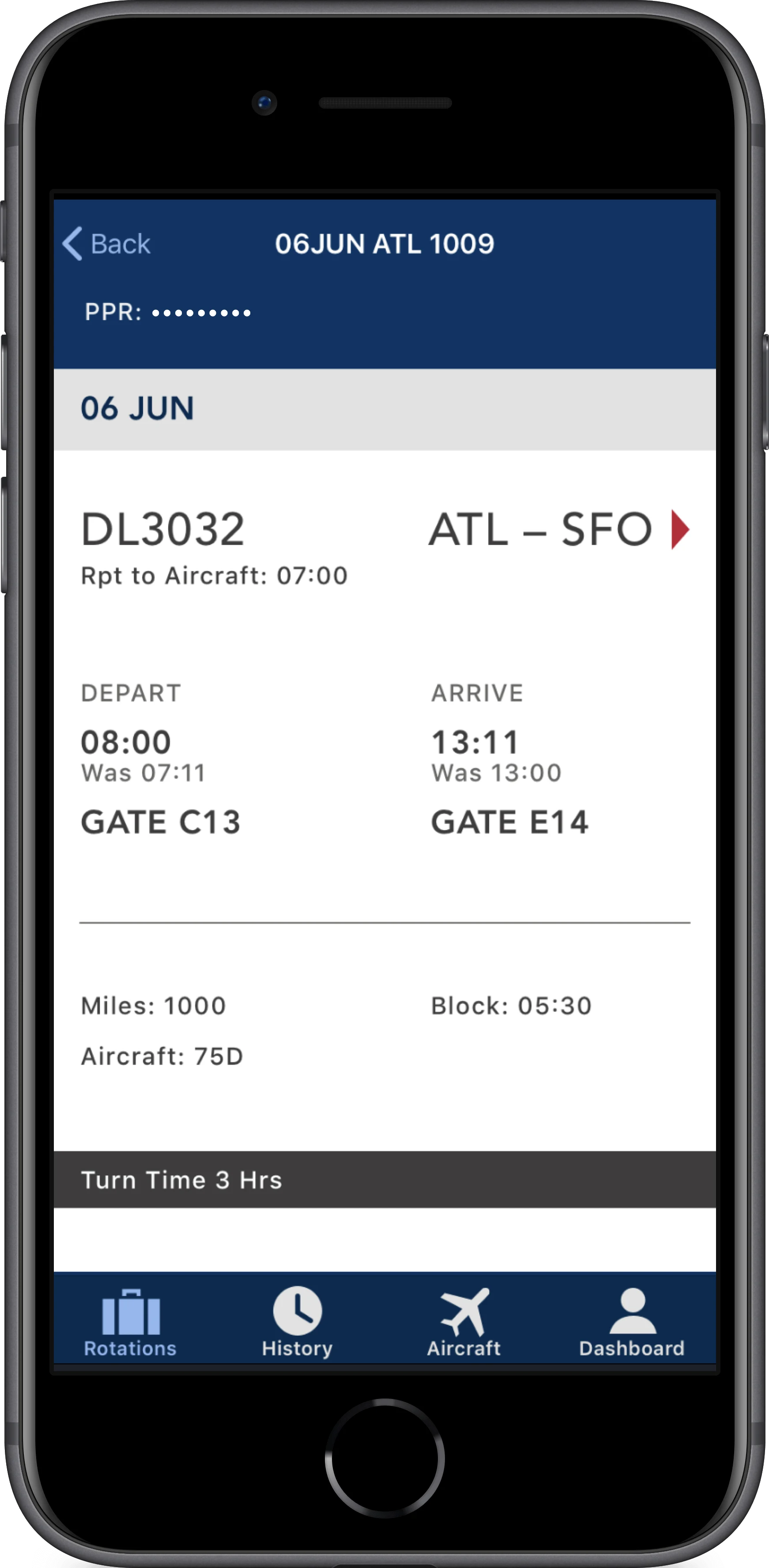
Before · one flight, as a record
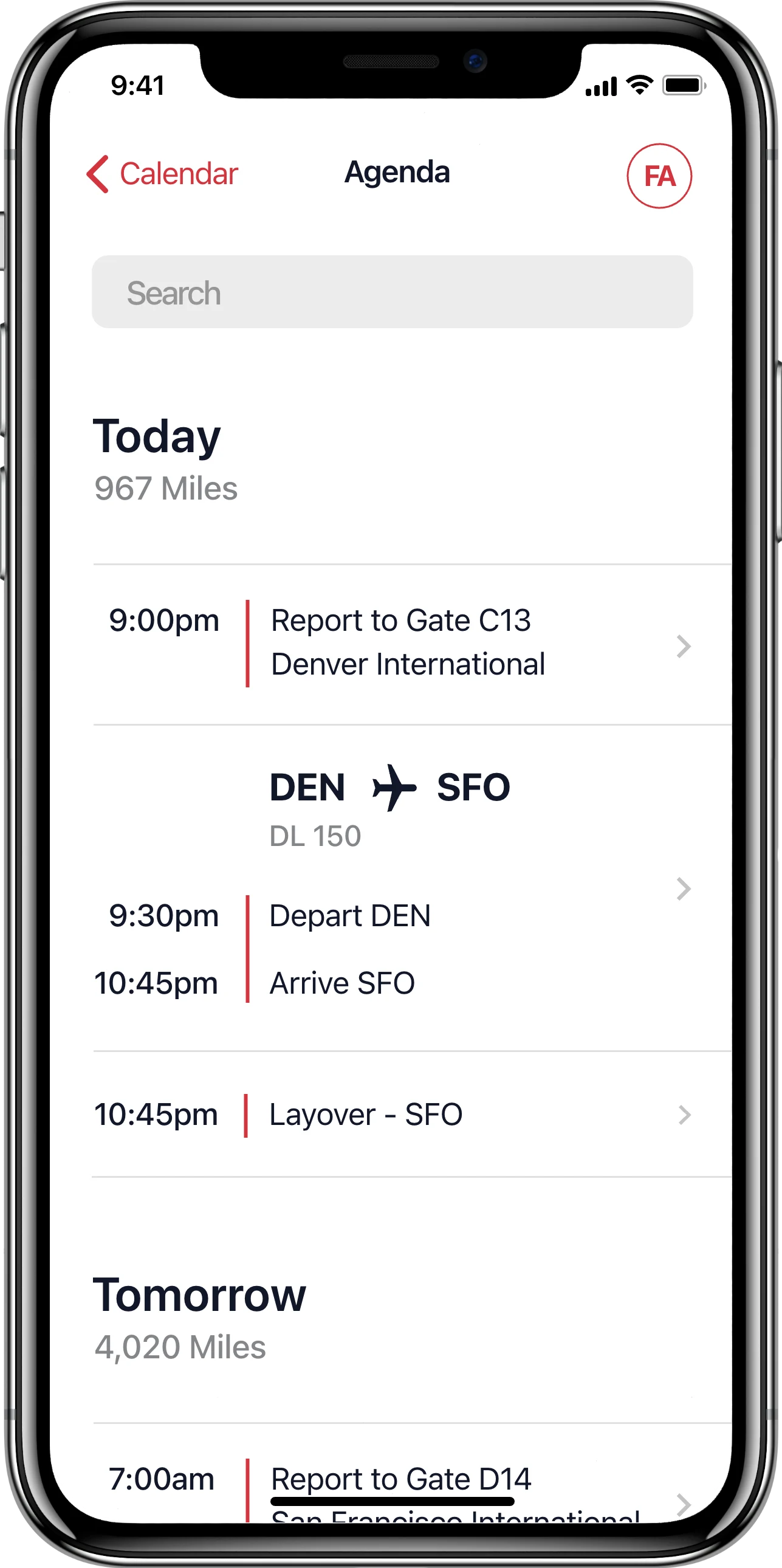
After · the day, in order


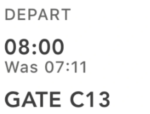

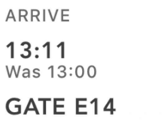



- 1Report
- 2Depart
- 3Arrive
- 4What's next
We chose a layout people already knew so it would need no explaining on a working day. The cost was that miles, block time and aircraft left the first screen. They moved one tap down, into the leg.
One tap to the leg
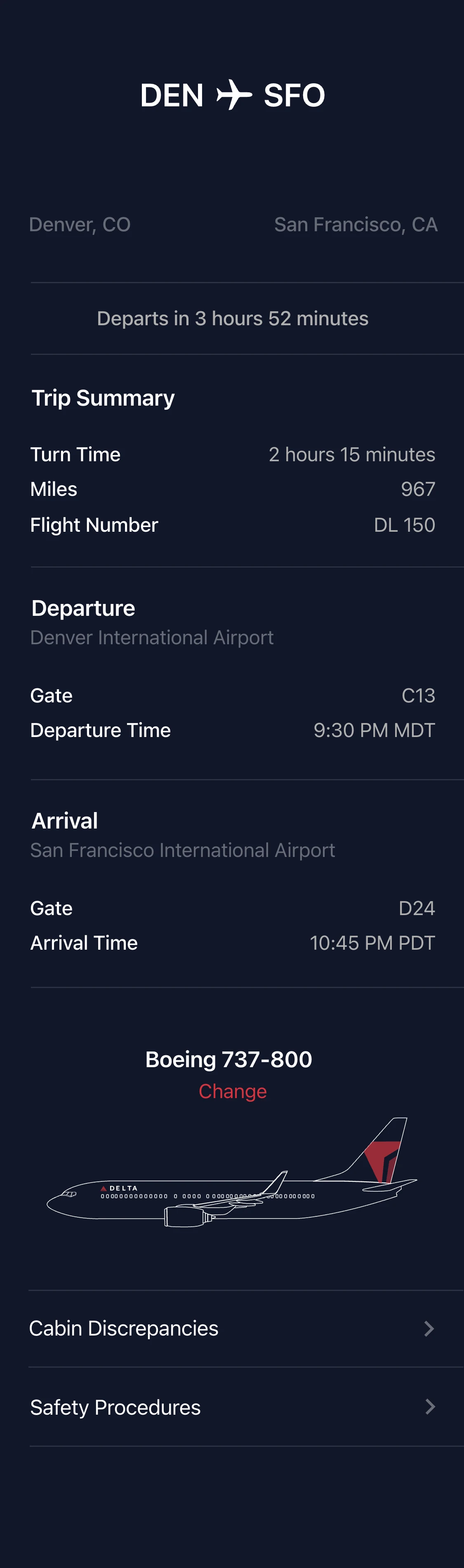
A leg opens in the same order as the day: route and countdown first, then trip summary, departure and arrival. Below those are the aircraft and its open cabin discrepancies. The back button reads “Calendar” on the agenda and “Agenda” on a leg, so getting out retraces the way in.


Four flight attendants in the room
When we presented the finished app, four flight attendants were in the room. One of them stood up and clapped. She had put real effort into helping us fix it, because the old app was that bad. For Delta’s executives, and for us, that was when we knew we had it right.
My part
I was the only designer on the engagement. I critiqued the existing app and made the case for starting over, facilitated the sprint, set the creative direction and design strategy, and designed the app’s screens in light and dark. I also contributed engineering to the app Delta shipped.
Every engagement taught the method as well. Delta’s executives and their direct reports worked through the sprint hands-on, and afterwards we stayed on as consultants for up to a month, giving feedback as they carried the work forward.
Outcome
The app shipped inside Delta and was adopted widely by its flight attendants. Delta ordered roughly 20,000 iPhones; our team was part of Apple’s sales enablement.